Jen Simmons’ 2019 Eventapart Talk
My notes from this talk
Note some coding conventions in this starter page (e.g. the viewport meta tag) and that she uses.
Jen Simmons is in CSS Working Group, so she's a "big name" in CSS.
(It's still OK to use <em> I see from this Brackets starter page.)
Intrinisic Design (post-responsive)
- Use <header role="banner">
- Pocket, a Firefox app, can port articles to be read on phone
- Reader modes don't use any of the CSS
- Use semantic HTML
- CSS starts with * {box-sizing: border-box;}
- border: in the Inspector is purple, margin: is yellow
- She says float: is circa 2007
- Then display: grid; grid-template-columns: 1fr 1fr 1 fr; recall that only Firefox has the grid display (use third column of code inspector); just uncheck the boxes to see what happens e.g. if gap: 2em; is turned off
- Also Responsive designer mode to resize the page (only)
- fr units don't let the content stick out, which happened with % in responsive/float era
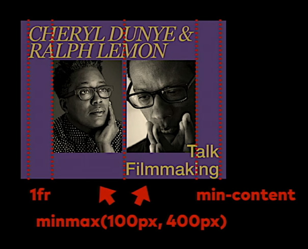
- she changes to grid-template-columns: max-content auto auto; (still 3 columns)
- Put the nav in a flexbox inside the grid (<header>) and there's a flex inspector to show it and (beta) gap: will work in flexbox
- could also use grid on the nav, but they aren't quite the same. This is from about 28:05
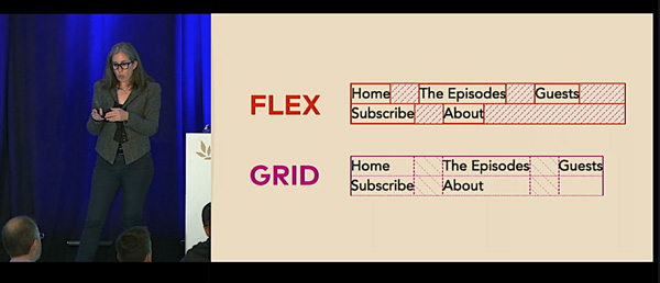
- Or maybe to make it more recent, circa 2015 not all in one row
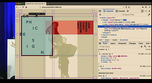
- That is .grid {grid-template-columns: min-content auto; grid-template-rows: auto auto; gap: 1rem 2rem;} and for .logo {grid-row: span 2;} .nav {align-self: end;} to move nav words down; this was example 7D I think
- See Philip VanDusen YouTube 15 trends in graphic design 2019
- splits up the letters in 6A put each one in a span start with grid-template-columns: repeat(8, 1fr); turn on grid numbers in the grid inspector
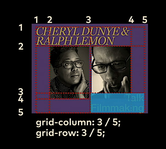
- again span:nth-child(n); position each item on the grid e.g. by .box {grid-column: 1 / 3; grid-row: 2 / 4;} it's this weird thing:
- look at caniuse.com for IE 10, 11, 12 and other odd browsers (the 9% that don't support grid according to StatCounter); then add @supports (display:grid {} i.e. a feature query
- at about 40 minutes: for images can use mix-blend-mode: overlay;
- Last one 8A-B-C uses overlaps; note the grid line numbers
- One more
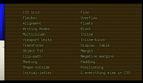
Here is her list of some new items (left) and older ones you should know (right)