Build on your Bootstrap starter page with the jQuery test removed. If you are missing things, correct or retype your code using the handout. I suggest linking to all the active components (Bootstrap CSS, Bootstrap theme, Bootstrap JavaScript, Google jQuery), rather than saving and bundling local copies. Also you still need
- an HTML5 doctype
- viewport, charset and http-equiv <meta> tags
- JavaScript shivs for IE 8 or below added using conditional comments; use the links on p.14 or the code here:
-
<!-- conditional comments for old IE 8 and below  -->
 <!--[if lt IE 9]>
<script src="https://oss.maxcdn.com/libs/html5shiv/3.7.0/html5shiv.js"></script>
<script src="https://oss.maxcdn.com/libs/respond.js/1.4.2/respond.min.js"></script>
 <![endif]-->
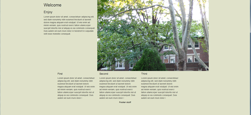
You will create a responsive grid that looks like this on large displays:
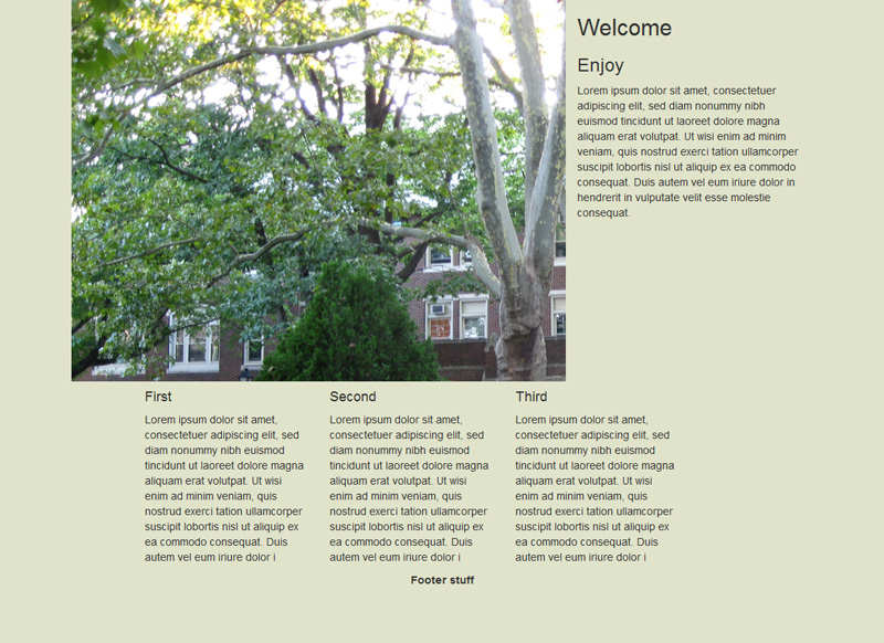
Then uses push and pull classes (p. 44) to make the image jump to the left for medium screens:
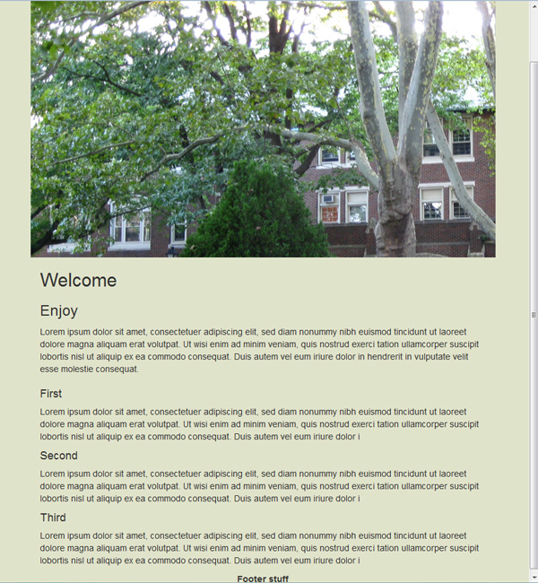
Then goes to a stacked layout for small and smaller screens:
Start with Chapter 2 (Grid System) but also check the resources on this week's page, reproduced here:
Bootstrap site, intro (Mindy McAdams), long video, short, and first parts (free) of the Sitepoint course. Two helpful Sitepoint posts on the Bootstrap grid and responsive design.
HINTS/Instructions:
- Give the first <div> a class of "container" so it's centered as in the first screen shot.
- There are three rows here, with two columns (<div>s) in the first row, three columns (<div>s) that use offset (p. 41) in the second row, and one footer column/<div> in the third row.
- To set up the rows, it's just <div class="row">.
- Remember that Bootstrap builds on classes, so you will have <div>s with several classes with a space between them (that is essential—space, no commas).
- You can do this any number of ways—I used only col-md-* classes for the sizes (not the push and pull).
- The footer needs to span 12 columns of the grid so col-md-12 (or col-sm-12) will do that.
- When Bootstrap CSS is linked, Dreamweaver or Brackets will auto-suggest all the class names when you are at <div class=" in the HTML.
- The default for columns when they get small is to stack—they will span the whole width and stack as in the third screen shot.
- Add the image with <img>. You can style the footer (centered text, bold) and add background color to the <body>with selectors you make.
- You can experiment with % width for the photo so it is (sort of) responsive or, better, add a class of "img-responsive" to your <img> tag. See demo on USB.
- Use a greeking (Lorem ipsum) generator such as the one here.
- The image of College Hall is here.
Post the file(s) online and send me the URL by Wednesday, Nov. 8. If you want to add any CSS add a <style> element to the header, or <link> to your CSS. Don't touch the Bootstrap CSS.
