Build on your Bootstrap starter page or your grid. If you are missing things, correct or retype your code using the handouts. I suggest linking to all the active components (Bootstrap CSS, Bootstrap theme, Bootstrap JavaScript, Google jQuery), rather than saving and bundling local copies. Also you still need
- an HTML5 doctype
- viewport, charset and http-equiv <meta> tags
- JavaScript shivs for IE 8 or below added using conditional comments; use the links on p.14 or the code here:
-
<!-- conditional comments for old IE 8 and below  -->
 <!--[if lt IE 9]>
<script src="https://oss.maxcdn.com/libs/html5shiv/3.7.0/html5shiv.js"></script>
<script src="https://oss.maxcdn.com/libs/respond.js/1.4.2/respond.min.js"></script>
 <![endif]-->
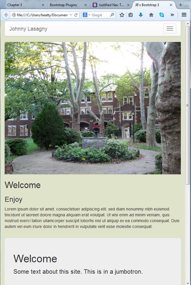
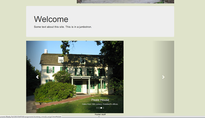
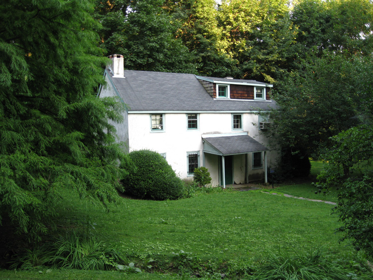
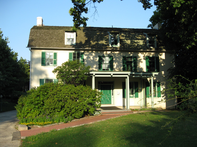
The images are here: college hall, statue, tea house, peale house
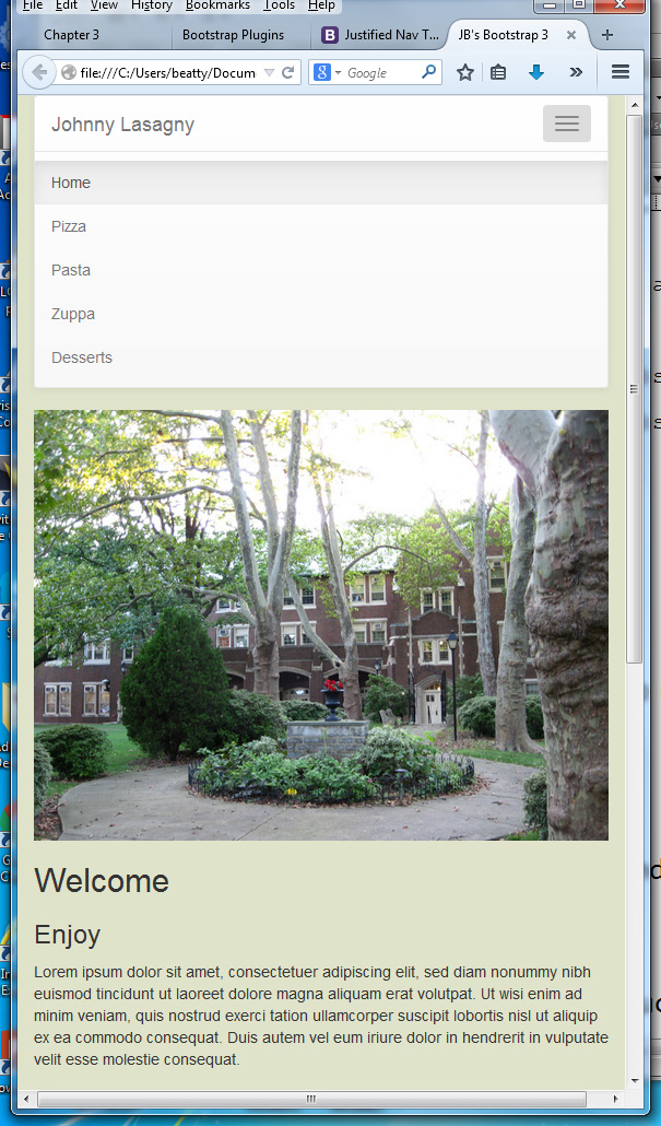
The nav bar
Will collapse to the hamburger icon (made with 3 glyphicons):
Then drop down when clicked:
And the carousel (plays automatically with the data-ride attribute) will be something like:
Remember to check the resources reproduced here:
Bootstrap site, this intro (Mindy McAdams), long video, short, and first parts (free) of the Sitepoint course. Two helpful Sitepoint posts on the Bootstrap grid and responsive design.
HINTS/Instructions:
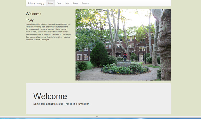
- Give the first <div> a class of "container" so it's centered as in the first screen shot.
- To set up the rows, it's just <div class="row">.
- Create a layout with at least three rows.
- The class img-responsive does not seem to work with background images, so use <img>.
- Remember that Bootstrap builds on classes, so you will have <div>s with several classes with a space between them (that is essential—space, no commas).
- One of your rows needs to include a carousel (p. 129) with at least 3 photos in it. Best is to size them the same in Photoshop. Note the screen shot has a full 12-column width, which you might want to change.
- Your navigation needs to be a Navbar (p. 66) that probably should go across the top, so that it can collapse to the hamburger icon. Be careful with data-target and data-toggle (Rahman gets them mixed up on p. 69).
- These are actually pretty easy—watch your </div> tags.
- Add at least one other component or plug-in. Some good choices might be:
- a Modal (p. 133); a Jumbotron as shown (alternative to a Page Header, p. 47); a stylized form (p. 80)—your final project needs a form; a Dropdown (p. 91); ScrollSpy (p. 106); Tooltip (p. 120)
- The default for columns when they get small is to stack—they will span the whole width and stack as in the third screen shot.
Post the file(s) online and send me the URL by Wednesday, November 29 (we might need an extension on this). If you want to add any CSS add a <style> element to the header, or <link> to your CSS. Don't touch the Bootstrap CSS.
