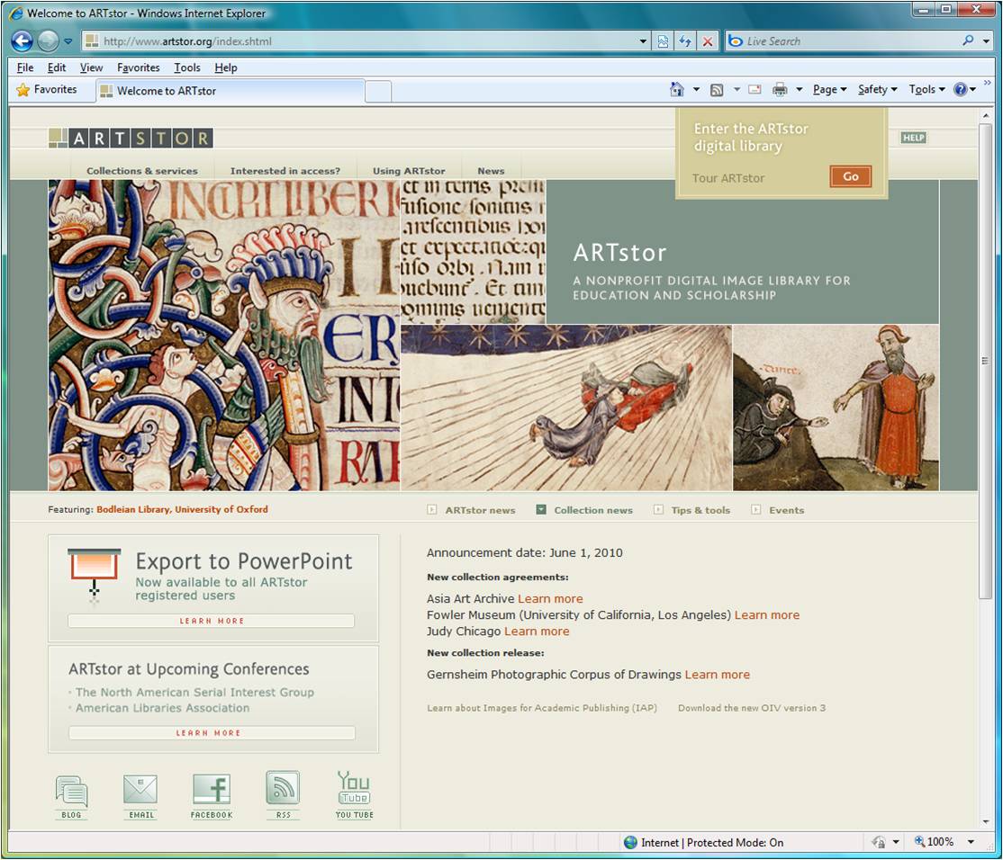
For my first webpage design analysis, I chose the start page for the ARTstor website http://www.artstor.org/index.shtml, a screen capture of which is shown below (showing images from the Bodleian Library). The featured images can change; for instance, during the time I was preparing this, another set of images available included a van Gogh, a Monet, a Hokusai, and a fragment of Egyptian sculpture (all from the Metropolitan Museum of Art).

ARTstor is a digital image library. As a library I should think it wants to project an image of scholarship and integrity while still displaying interesting images that capture the viewer's attention. The subdued, low saturation color palette of the design is not flashy and conveys a sedate and serious ambiance. The design features rectangular shapes. The horizontal and vertical edges of rectangles are consistent with the staid atmosphere and are more appropriate for instance than a diagonal line/edge that might be more dynamic. The use of rectangular shapes is also to some extent pragmatic since the images change and it is easier to prepare rectangular images.
The logo is a set of eight rectangles (squares or very nearly squares). The first rectangle is divided into sub-rectangles with the same low saturation (though perhaps somewhat darker) color palette. The logo's first rectangle to some extent repeats the design of the main image "banner". The remaining seven rectangles contain the letters of the name "ARTSTOR" in a simple sans-Serif font.
The design is not very liquid, but does have a left and right "gutter" that allows the page to conform to different browser sizes. The gutters are, of course, also rectangular in shape and use the same colors as the rest of the page.
The block in the middle top (slightly off center) of rectangular image banner is a perfect square, while the block in the middle bottom has a proportion of 2-to-1. The rectangle in the upper right has similar proportions (2.72-to-1) to the overall image banner (2.86-to-1). Another set of similar ratios is:
The rectangles' positioning and sizes are varied (and are not over simplified) and yet maintain a sense of balance. Also as another practical matter, the constituent rectangles have varying aspect ratios so that images can be paired up with a rectangle of suitable size and shape.