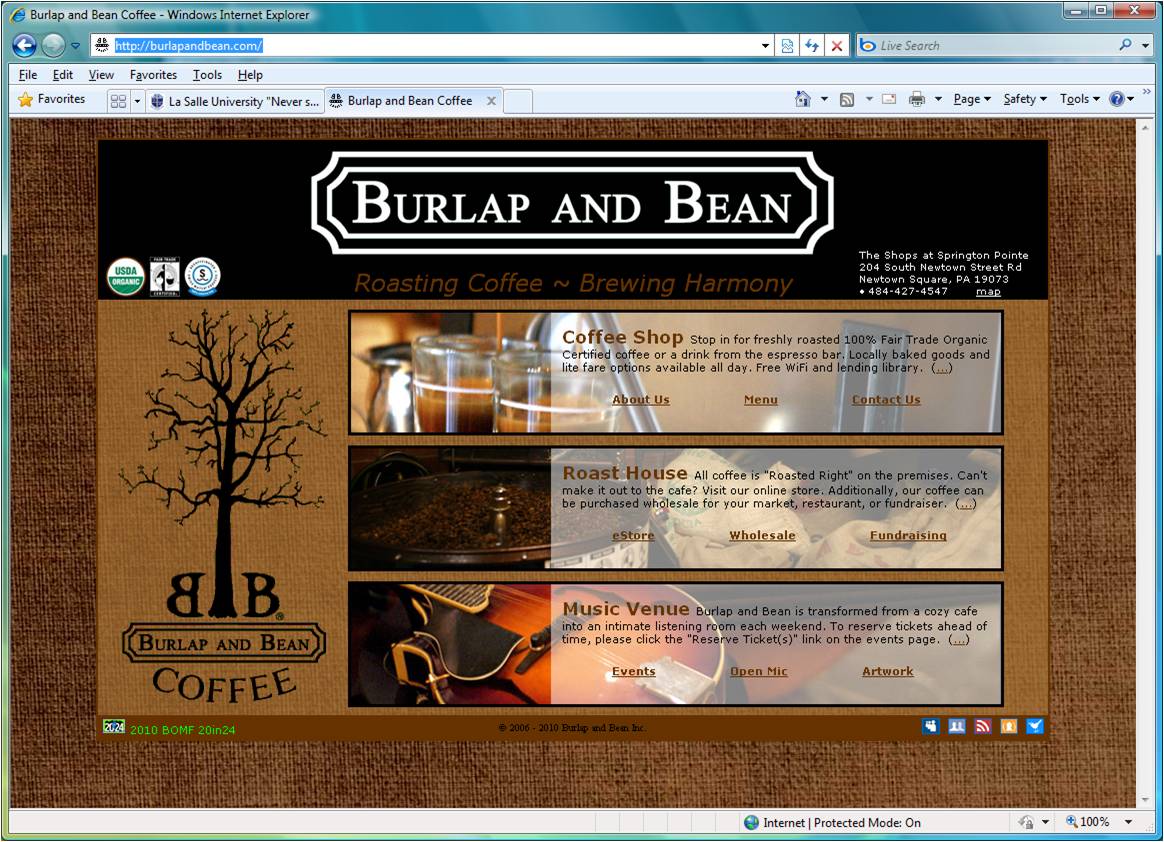
I chose the website http://burlapandbean.com/, a screen capture of which is shown below

as an example of texture. The burlap textured background was an obvious choice given the name of the company, and it helps to convey a sense of the "natural" or "organic." The image is large which has the advantage that one's eye does not immediately pick up on the repeated pattern but has the disadvantage that the image loads a bit slowly.
Whereas one can see through the lighter brown to the burlap, one cannot see through the medium or darker brown. The inconsistency bothered me a little bit. Transitioning from the organic, textured background to the flatter, more plastic interior information section is an issue. I am not sure how I would solve it.
The three rectangular boxes -- all with image on the left and a similar amount of text and three links at the bottom -- is a good use of repetition.
For the most part the page follows a consistent color scheme. However, it is disrupted by the various icons and seals. I found the green text at the bottom particularly annoying. The site http://www.artstor.org/index.shtml that I considered previously put the standard icons, such as that for an RSS feed, into their color scheme. I think this solution would work for the images in the lower right but perhaps not for the images in the upper left of the Burlap and Bean page.