My idea is to design a webpage to display an art collection where the pieces of the collection fall into the basic categories:
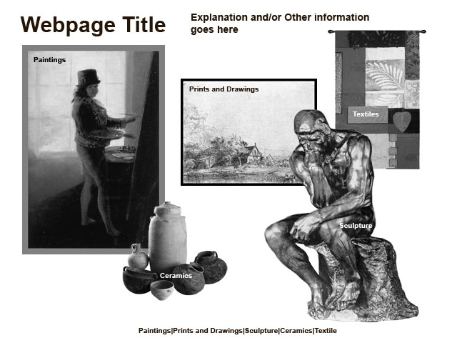
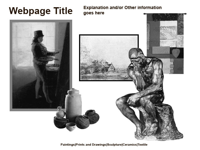
The home page features five images (one for each category) that will serve as links to subsequent pages that would allow a viewer to browse through the collection. The Paintings image, as well as the Prints and Drawings image, is a simple rectangle; and the Textiles image is only the slightest deviation from a rectangle. The Ceramics and Sculptures image shapes, on the other hand, are much more complex. Their shape is brought out by the empty white (negative) space surrounding them.

I have attempted to draw the viewer's eye around the page. The Thinker's knee "points" over to the collection of ceramics, which in turn lead one up to Goya's legs. Goya's painting hand directs one's eye over to the Rembrant etching, the horizon of which slopes down bringing one back to the Thinker. If the viewer reads the text across the top, the tapestry would take them from there to the Thinker and subsequently into the visual loop discussed above.
One aspect I am trying to come to terms with is whether the images should have overlaying text to clue to viewer in that they represent categories and should be clicked. With the text present I might be able to eliminate the more conventional navigation currently located at the bottom. Shown below is what it looks like without the overlaying text.

I also include a link to the zipped up Photoshop file Comp_1.zip.
Another thing I am thinking about is whether the ceramics image should be bigger. I am probably being too literal by having it smaller than the other category images.
Also in the back of my mind is that the images used are not items from the actual collection. I do not have readily available images of items from the collection.