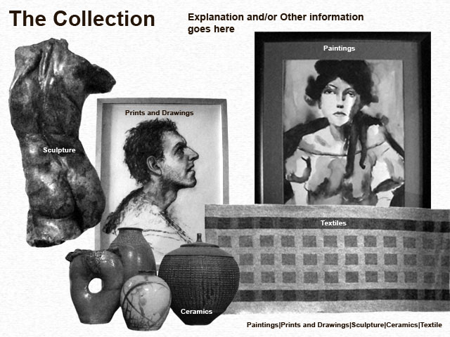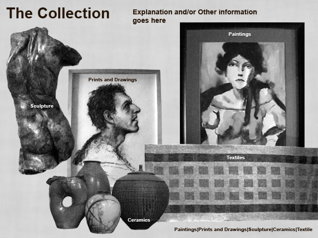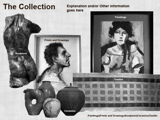
One thing I found dissatisfying with the first version was that it did not use images from the actual collection. So the redesign below addresses that issue.

I wanted to see what the background would look like with a subtle texture replacing the white. The following are my attempts to experiment with this change.


I don't like the textile image. I may attempt to get more of a drapery effect out of it.