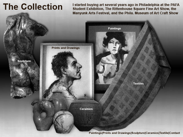
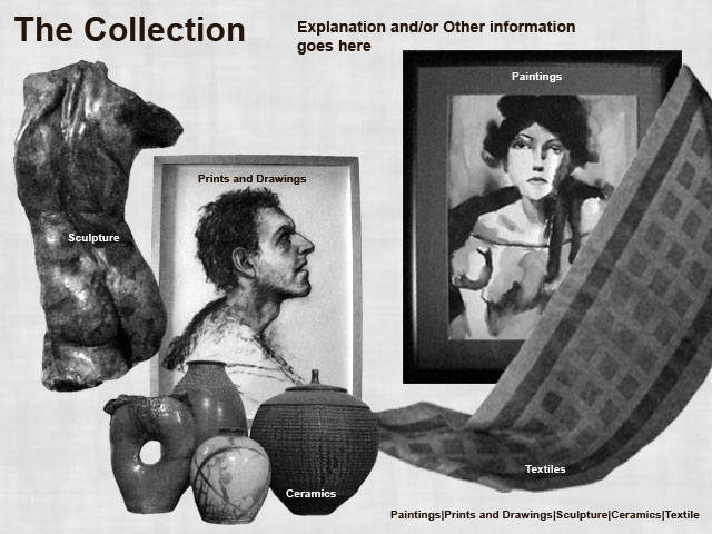
Below is my composite for Week 4. To experiment with value I have added to the background a reflected gradient as well as drop shadows for the various images. I had already played with subtle textures in Week 2, but I switched the texture to the one I thought worked better with the gradient.

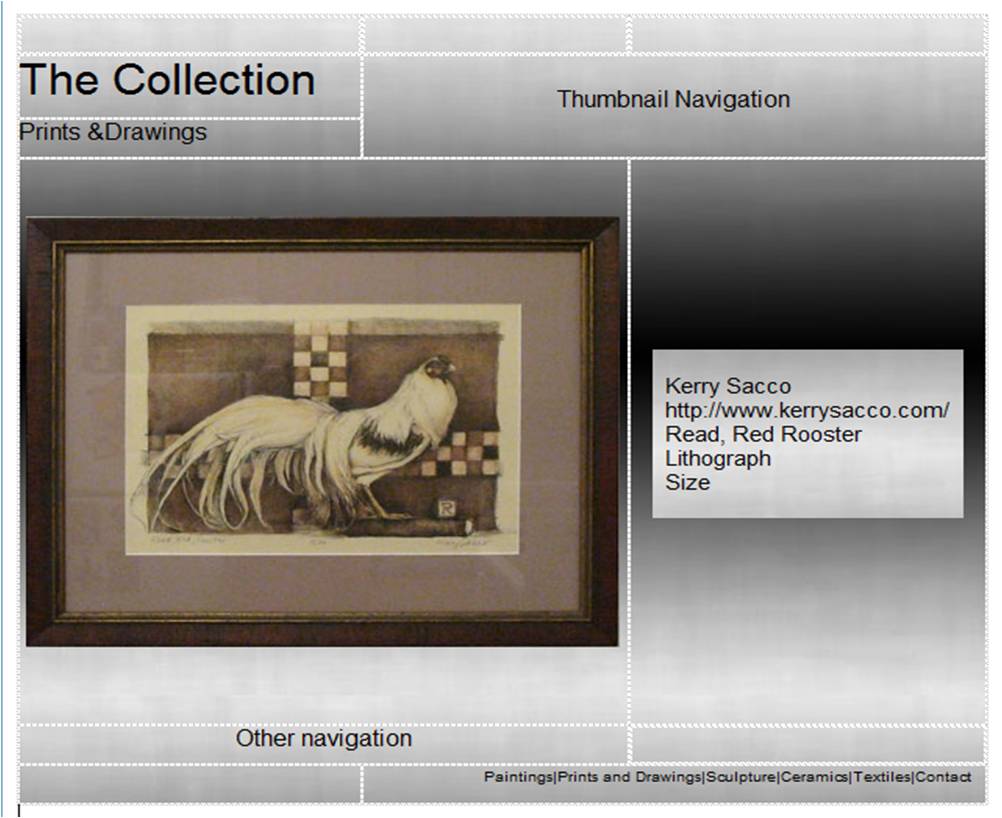
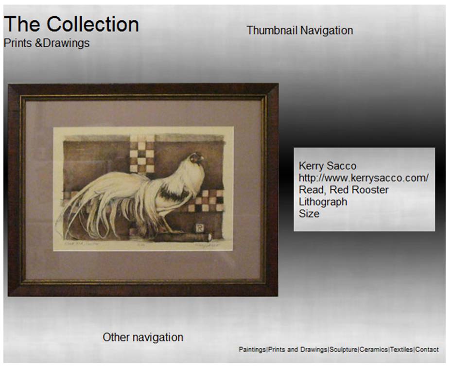
I thought it would probably be more relevant to show the layout grid for a page showing an individual work of art instead of the splash page shown in the previous composites. I would anticipate having a few thumbnails across the top right and if there are several pieces in the particular category there would be some kind of forward and back buttons allowing the viewer to move through the thumbnails. Under the main image I anticipate a one-by-one navigation with buttons. I tried to connect this page to the splash page by using the same background, the same title (upper left), and the same links (lower right).
Regarding the rules of composition, I placed guidelines on the splash page around the edges to ensure that I did not get too close to the edge. I placed a vertical guideline about .618 times the width to have a "golden section" composition scheme. The water-color painting image was aligned with this guide so that it passed between the eyes and along the nose of the woman in the portrait and that the word "Paintings" was also centered on this line.
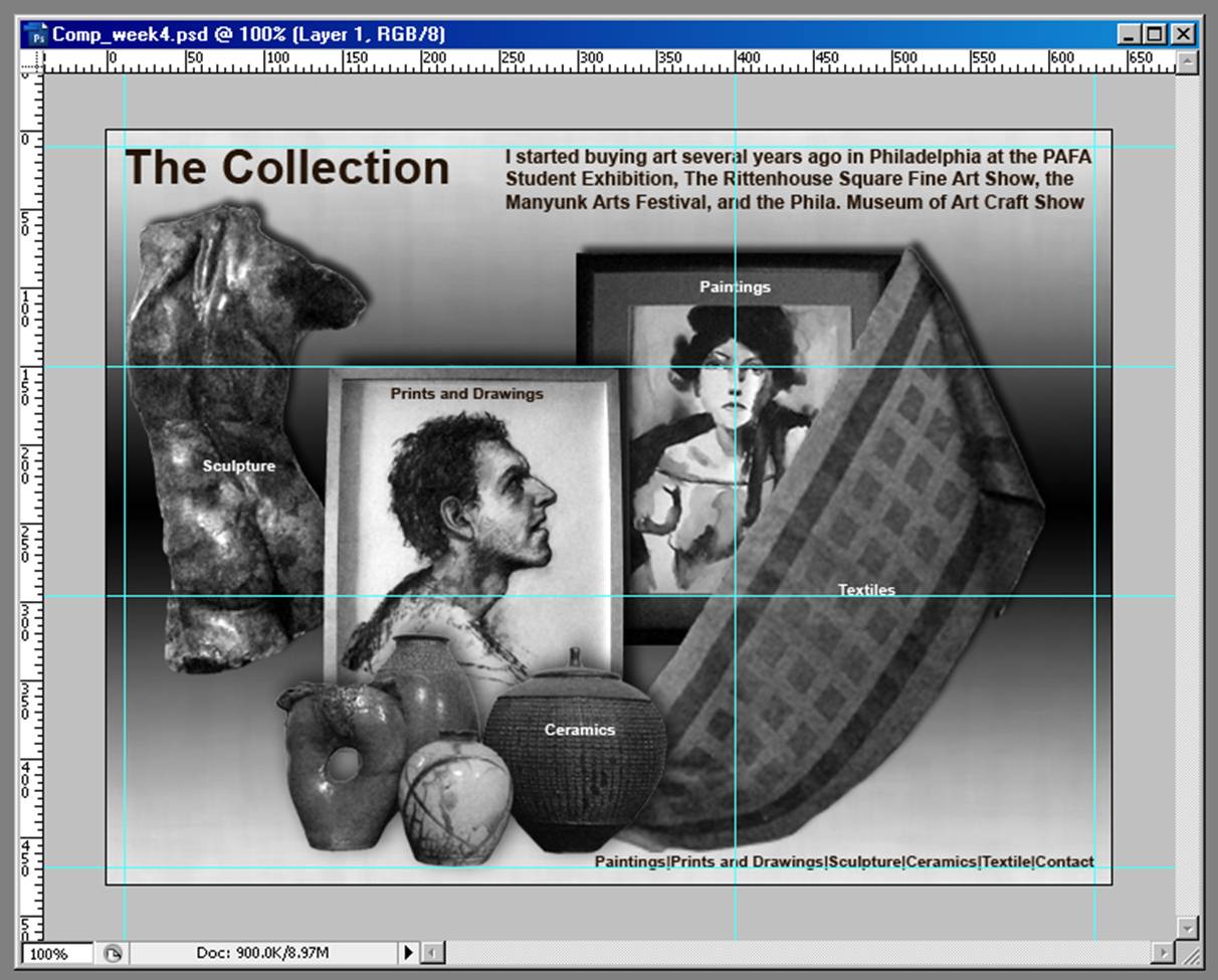
I added two horizontal guidelines that divided the composition roughly into thirds. I placed the upper edge of the drawing (man) on the upper guideline in addition to having the guideline pass though the eyes of the woman in the portrait. I also placed the left-most part of the sculpture at this level. Along the lower guideline, I have placed the sculpture's ass cheek, the mat of the water color portrait and the word "Textiles." It can be compared to the composite from Week 3 show below. (Here are some links to some previous composites: Comp_2c.jpg, Comp_2b.jpg, Comp_2a.jpg, Comp_2.jpg, Comp_1a.jpg, and Comp_1.jpg.
When I lined the composite up against the WebPage Design for Designer's grid, I found that four of the five category links were contained in the smallest (600 by 300) setting, that all five links were contained within the next smallest (760 by 480) and that the only thing requiring the third (955 by 600 grid) was the secondary/backup links.