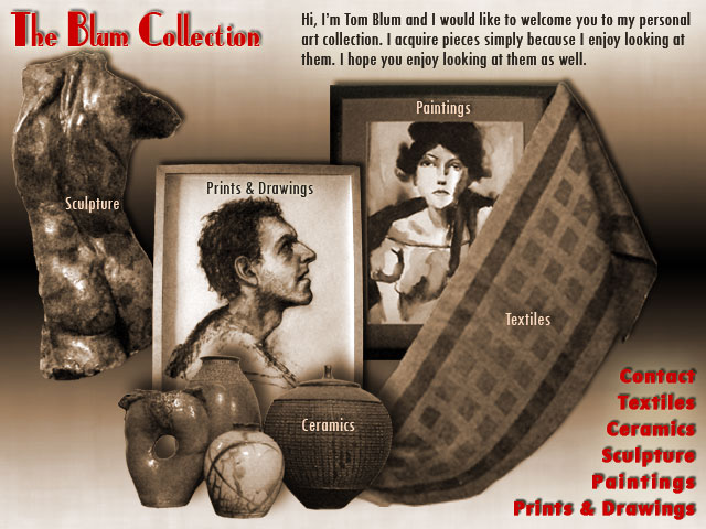
Below is my composite for Week 5 which incorporates font and color.

The above uses two fonts. The main title is in a font called Anchor Steam that I downloaded from http://www.1001freefonts.com/afonts5.php. For me it evoked an atmosphere of the Jeeves stories of P.G. Wodehouse. The rest of the text is in Tw Cen MT Consensed. The Twentieth Century font seemed very legible and did not clash with the Anchor Steam. I did a lot of playing with shadows and glows to make the font stand out a little more.
As for color, because subsequent pages will feature art work, I wanted the main color to have a very low saturation. I applied a Hue & Saturation Adjustment layer to a black and white background with the Hue at 30 degrees (an orange hue) and the Saturation at 25%. I also wanted to have one higher saturation color to be used sparingly. I chose red (Hue 0 degrees, Saturation 100% and Brightness 80%). (I guess that with the use of red and orange that this is in some sense a warm analogous color scheme.) I struggled with this choice and am still not convinced I shouldn't have just gone monochromatic.
(Here are some links to some previous composites: Comp_week4.jpg Comp_2c.jpg, Comp_2b.jpg, Comp_2a.jpg, Comp_2.jpg, Comp_1a.jpg, and Comp_1.jpg.