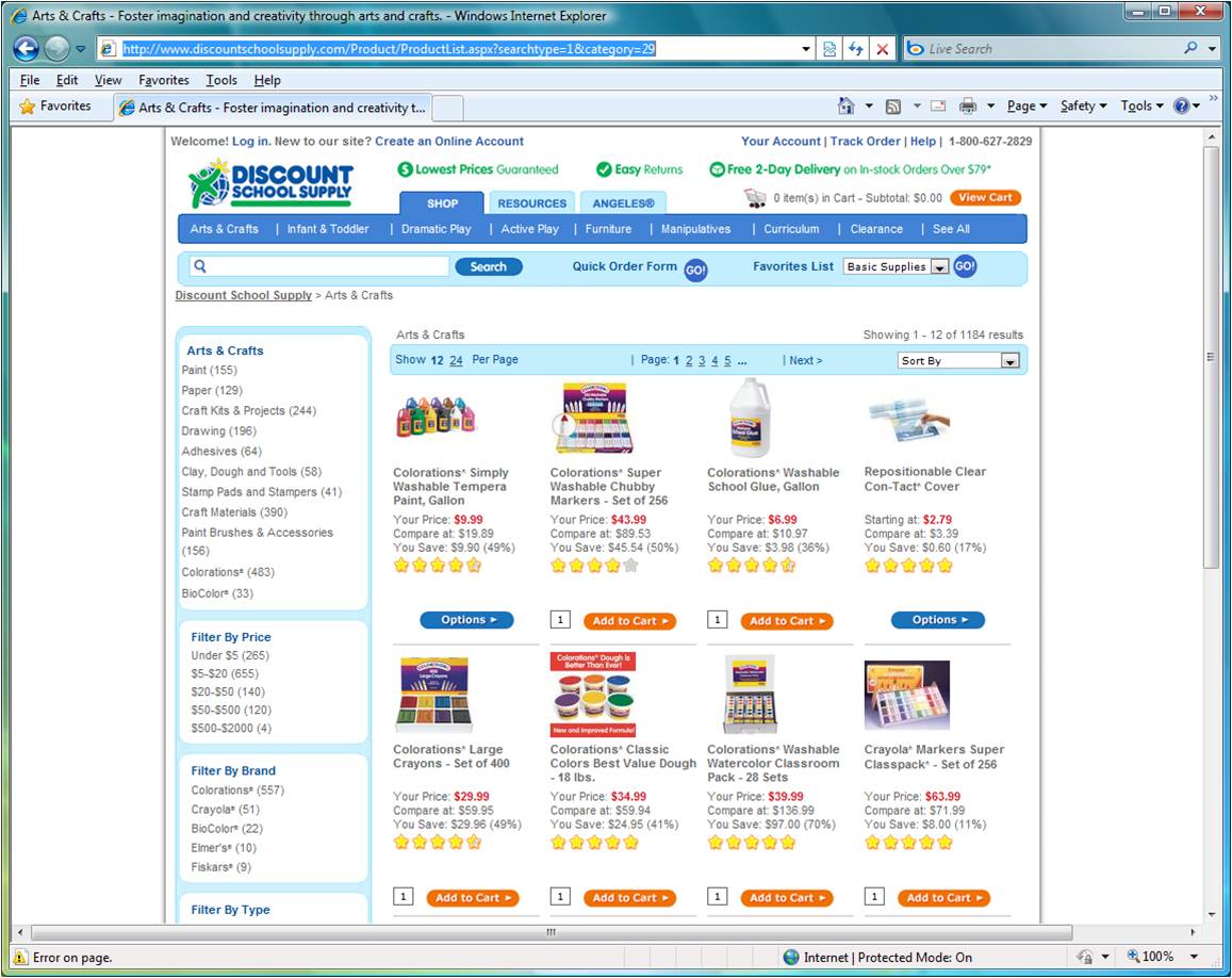
For my second webpage design analysis this week, I chose the home page for Discount School Supply http://www.discountschoolsupply.com/Product/ProductList.aspx?searchtype=1&category=29, a screen capture of which is shown below
I think that this page makes good functional use of repetition. There is the repetition in the tab structure at the top that allows one to find product categories and sub-categories. Another repetition is the column of rounded blocks on the left. Each block provides a way to filter the products (e.g. by price or by brand) and within a block are links to specific "values" for that filter (e.g. Under $5 or Crayola). Then, of course, there is the main repetition of the products themselves. Each product occupies the same amount of space and has a image, a title, a price, a rating, and an option to add it to the cart or to choose some options (and then add it to one's cart).
There is a connection between the filtering options on the left column and the category choice a user made in the tabs near the top. I think the design could make this connection clearer. I might try moving the search and bread crumbs above the category tabs and then make the selected tab the same color as that around the filter blocks without horizontal break (or the horizontal break having that same color). There would then be a visual connection between the tabs and the filter option blocks. This would also serve to remind the user which category has been selected.
Two problems with this page are the JavaScript error (as evidenced by the caution sign in the lower left) and the ever present horizontal scroll bar.