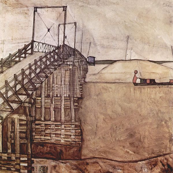
For my "eye tracking" image analysis, I chose "The Bridge" a painting by Egon Schiele.

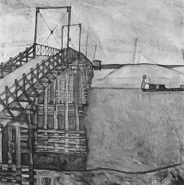
which when desaturated of color looks like:

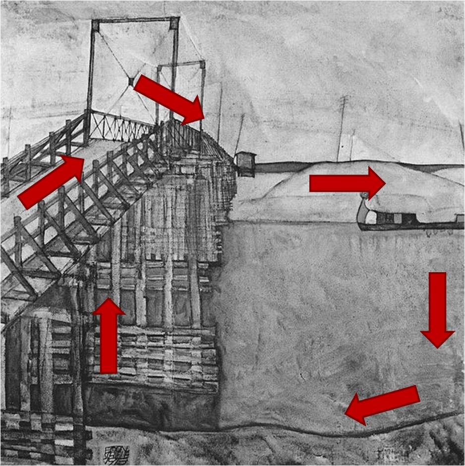
My eye starts on the bridge on the middle left and follows the path of the bridge, moving up and toward the center. Next, my eye encounters the vertical, rectangular tower(?) structure(s). Each structure has an "X" of cables -- their repetition and perspective lead me now downward and toward the center -- actually to that shed which is somewhat left of center. After that I am drawn horizontally mainly by the horizon, but also by the telephone/telegraph wires and distant shore line.

Once reaching the right edge of the painting, my eye was drawn along the edge vertically downward until reaching the near shore line, which took my eye along the bottom of the painting horizontally and to the left. Finally the underlying support structures of the bridge led my up vertically and back onto the bridge.
Whereas the bridge, horizon, distant and near shoreline present a heavy, bold line that draws the viewer around the page as discussed above, the river and sky regions are comparatively empty. While these spaces reveal some painterly brushwork, their relative calmness offers some relief from the busier parts of the painting.
Just for fun, here are two YouTube videos on Egon Schiele