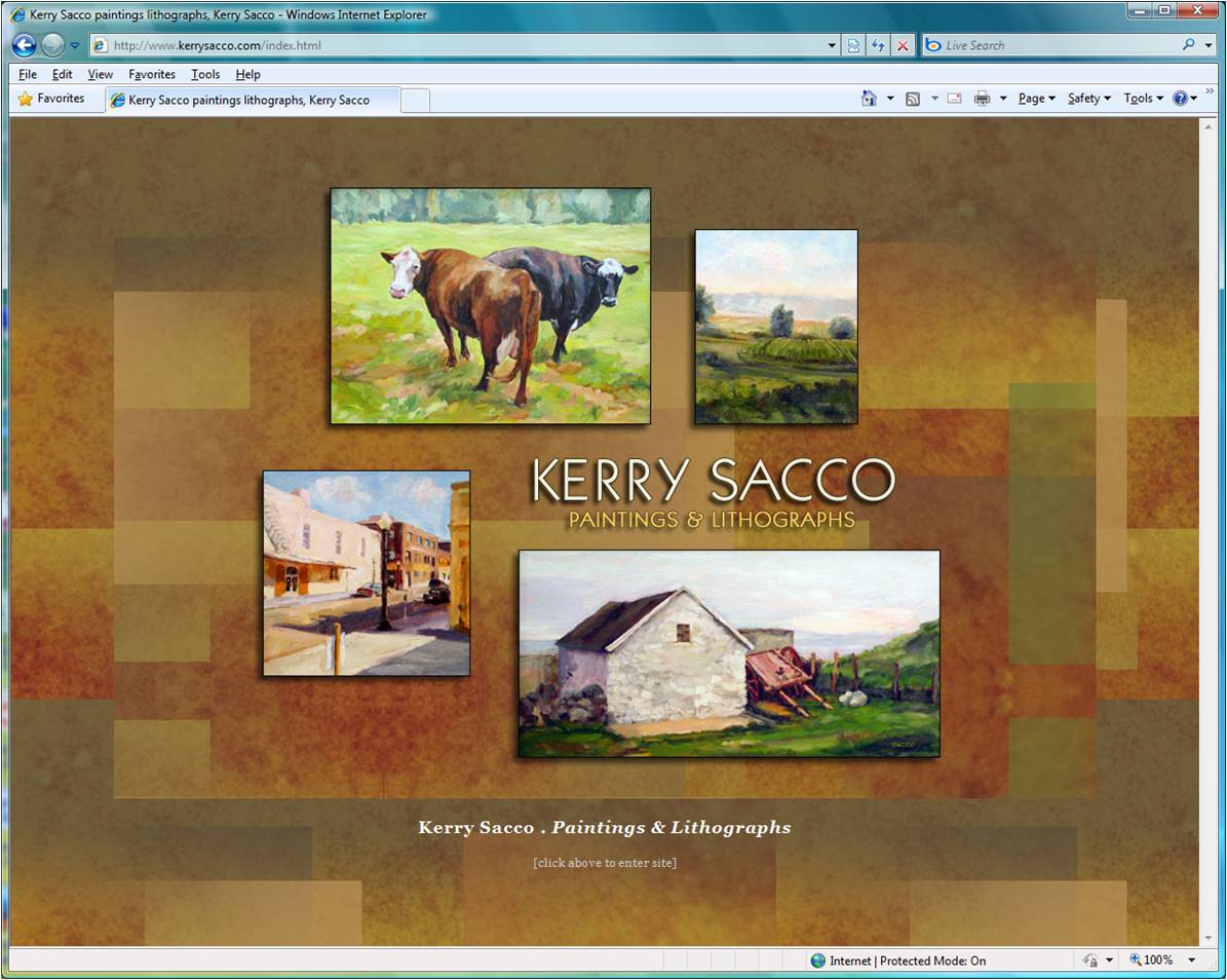
For my second webpage design analysis, I chose the home page for the artist Kerry Sacco http://www.kerrysacco.com/index.html, a screen capture of which is shown below

The background is comprised of rectangular shapes of mottled color that evoke (probably are) close ups of paintings, which seems fitting for an artist's website. On top of these lie some smaller, colored translucent rectangles that give the background a greater degree of variety without disrupting the unity of the page. There are actually what I will call two backgrounds which one can see by changing the horizontal size of the page or if in Firefox by clicking slowing in the center of the page where the "inner" background will have a dotted white border before navigating to the About page on the mouse up. The (real) "outer" background is similar but seems to have a somewhat larger scale. This device allows the page to have a pretty consistent feel for different horizontal browser sizes.
The colors chosen are reminiscient of the autumn. And I find the rectangles reminiscient of the patchwork of fields one might see overlooking the country side. I feel that these choices suit an artist whose subject matter often includes small town and country landscapes and farm animals.
The border and block shadow of the painting images and central text serve to lift them up out of the background. The text at the bottom by contrast seems very flat.
I find the size and positioning of the four painting images is effective in keeping my eye moving around the page.