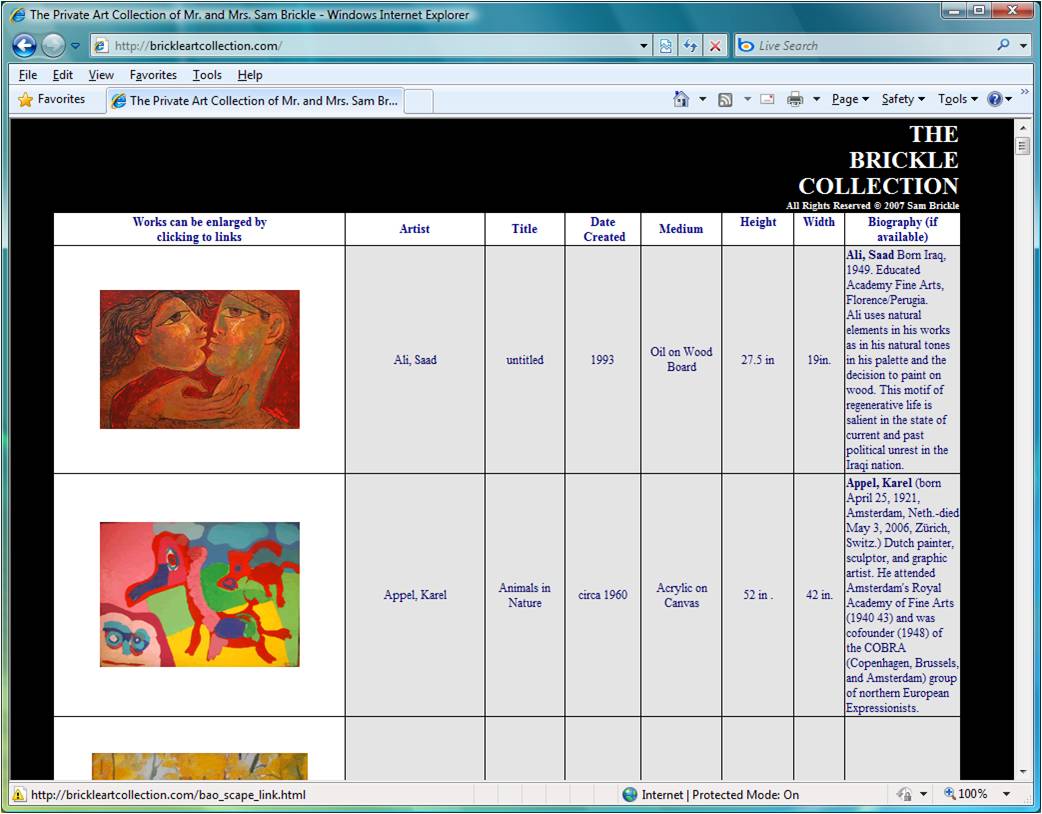
It was difficult to find a site for a private art collection as opposed to a site for a museum (which is trying to bring in visitors), or a gallery (which is trying to attract customers) or an artist (who is trying to establish a reputation or to sell work). It is not necessarily that such sites don't exist but probably that the other sites have a stronger (commercial) motivation for optimizing their sites to be found by search engines. I did find the site http://brickleartcollection.com/, a screen capture of which can be seen below.

This site is pretty perfunctory in its design. It has a very long table with eight columns and many, many rows that presents images of works of art and information about them. The images are links to individual pages featuring a single work of art with the same information as in the table. I appreciate the site's honesty and straightforwardedness -- its emphasis is clearly on the art (and it's an impressive collection). It is easy to see what the site is about and how to navigate around in it. As for the site's design, there wasn't a lot to like, but I did like the right justified text at the top with each word on its own line. (I don't know why.)
While it was easy to see how to navigate the site, it required a lot of vertical scrolling. This makes me think about my site because one idea I had was to have a column on the right with images, but then the main part of the page would be more like the indvidual pages here -- a large image for the selected work and its associated information. But this has me wondering if my column would require too much scrolling. It would not be the whole page, but still it's scrolling. If I were to stick with their simple design, I would try some of the following
I did find the site http://www.brickleartgalleries.com/index.htm which suggestions that maybe the items in this collection are up for sale after all. However, this gallery site is weirdly unfinished. For instance there is place-holder text on the About page and the fax number on the Contact page is 401.XXX.XXXX. But even this has served to make me wonder whether I should include an About and Contact page even if I am not trying to sell anything.
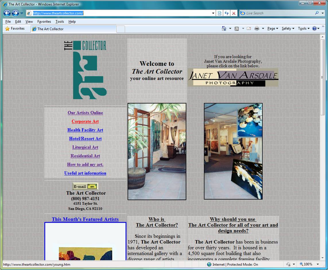
For my second "competitor" site I chose http://www.theartcollector.com/ which is a gallery site and not the site showing a private collection; however, I grew tired of looking for a site that was not trying to sell something. A screen capture of the site is shown below

I like the subdued (unsaturated) cool color scheme. It conveys a relaxing environment in which to browse. I also like that they establish who they are in the "Who is The Art Collector" box right here on the home page instead of on some subsequent About page. But perhaps they should try a best of both worlds approach -- the first couple of sentences of this and then a link. The "Who is ..." and "Why should you ..." sections are a bit long and require too much vertical scrolling.
The three columns have almost arbitrary widths, no space between them and text that runs up to the edge. I could see it if the middle column was the widest, but it is the thinnest. At places the two columns run together and are difficult to read.
The link on the upper right is confusing, does not fit in with the color scheme, and didn't work when I tried it. I think there's too much vertical space between the list of links on the left and furthermore I don't like the centering of the links nor the red color for the last visited link.
I would try placing shortened versions of the text (with links to full blown pages) in the same middle column, which is either wider than or as wide as the other columns. I would try placing both of the gallery images in the same column on the right. I would try placing the featured artist on the right at the top -- the space now occupied by the broken link. I might also try to tie the text at the center top to the logo. Use the same font and colors.