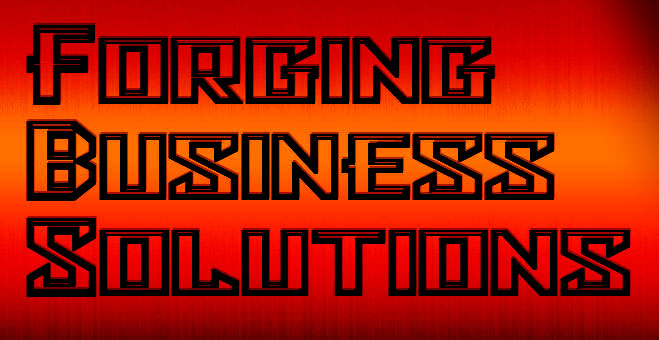
From the selection of tag lines I chose "Forging Business Solutions" and came up with the following

Picking up on the word "forging", the colors are based on the idea of metal glowing hot when it is in a forge. There is a texture of steel which give those fine vertical striations. At first the gradient colors were less saturated because I had reduced the opacity a bit to let the texture come through (perhaps I was using the wrong blending mode), but afterward I added a Curves Adjustment layer which allowed me to pump up the colors. I chose the Bulwark font I downloaded from http://www.1001freefonts.com/bfonts12.php. I felt it conveyed a sense of substantiality. It is not a well developed font. It's a little pixelated and doesn't support bold. However I used Photoshop's faux bold to improve the situation. It was fortuitous that each word was one letter longer than the previous and that they each contianed an "i" as this gave that staircase effect on the right. I increased the vertical scale of the the first letter in each word to tie the lines together a bit more.