
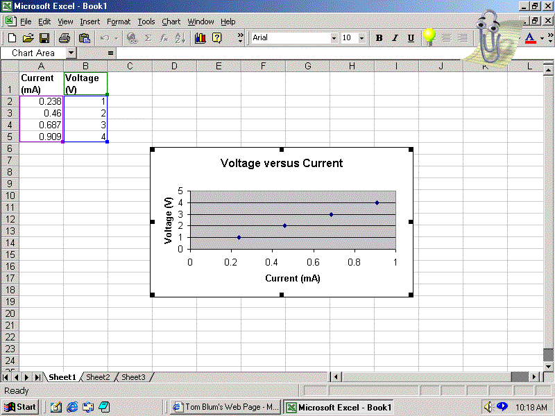
The Voltage versus Current graph is now on the sheet, and we proceed to fitting the data. If the graph (a.k.a chart) is highlighted, you will see the little black squares in the corners and on the sides. When the chart is highlighted, you will find Chart on the menu bar, and under Chart, you will find Add TrendLine.... item. Clicking the Add TrendLine.... option leads to the dialog box shown on the next page. (If the Add Trendline feature has not been used in your Excel, it may appear on the menu, but a set of double downward-pointing arrows should be there. Click on the arrows and then you should see Add TrendLine.....)
 PREVIOUS
NEXT
PREVIOUS
NEXT